
How to Match Paint Colors with Your Home Decor: 5 Tips from Interior Painters
With interior room remodeling being a popular choice, it’s no surprise that matching paint colors with home decor is a key concern for many homeowners. In fact, interior room remodeling was the most frequent project carried out by U.S. homeowners who renovated their property in 2023. To help you achieve a harmonious and aesthetically pleasing space, here are five expert tips from interior painters in West Hartford, CT, on how to effectively match paint colors with your home decor.
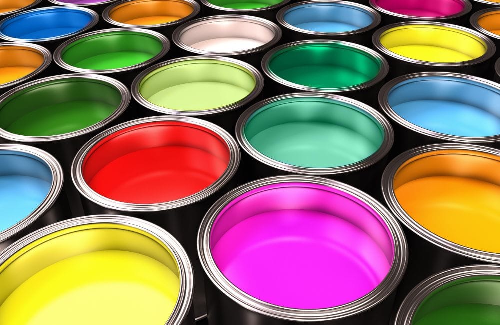
Tip 1: Understand Your Color Scheme
Interior painters emphasize that when it comes to home decor, understanding color schemes is crucial. Interior painters often refer to three main types of color schemes: monochromatic, complementary, and analogous.
- Monochromatic: This scheme uses varying shades of a single color. It creates a cohesive and soothing look but can lack contrast if not done thoughtfully.
- Complementary: According to expert interior painters, this scheme involves colors that are opposite each other on the color wheel. It creates a vibrant and high-contrast look, perfect for making a bold statement.
- Analogous: This scheme uses colors that are next to each other on the color wheel. It provides a harmonious and pleasing look, often found in nature.
How to Identify the Existing Color Scheme in Your Decor
Before you start selecting paint colors, it’s essential to identify the current color scheme in your home decor. Here’s how interior painters suggest you do it:
- Evaluate Dominant Colors: Look around your room and take note of the most prominent colors in your furniture, artwork, and textiles.
- Check Accents and Accessories: Identify the colors used in smaller items like cushions, rugs, and decorative pieces.
- Analyze Patterns and Textiles: Examine any patterns in your decor, such as those in curtains or upholstery, to see which colors are frequently repeated.
Choosing Paint Colors that Enhance and Complement Your Current Scheme
Once you’ve identified your existing color scheme, the next step is to choose paint colors that enhance and complement it. Here are some strategies recommended by top interior painters:
- For Monochromatic Schemes: Select varying shades of the main color to add depth and interest. Use lighter shades for larger areas to create a sense of space and darker shades for accents.
- For Complementary Schemes: Choose one color as the dominant hue and use its complementary color for accents. Be mindful of the intensity of the colors to avoid overwhelming the space.
- For Analogous Schemes: Pick one color as the primary hue and use the neighboring colors for a subtle and cohesive look. Ensure there is enough contrast to avoid a monotonous appearance.
Tip 2: Use Color Psychology
Understanding color psychology is key to making informed paint choices. Color theory indicates that certain colors and their frequencies can affect your feelings and behavior both physiologically and psychologically. Interior painters emphasize that each hue can evoke different emotions and set various moods.
Examples of How Different Colors Influence Feelings and Perceptions
Understanding how different colors influence feelings and perceptions can help you create the perfect ambiance for each room in your home. Here are some examples of color associations and the ideal spaces to use them:
Color | Associations | Ideal Spaces |
Red | Energy, passion, excitement | Dining rooms, social spaces |
Orange | Warmth, enthusiasm | Living rooms, kitchens |
Yellow | Happiness, optimism, brightness | Kitchens, playrooms |
Blue | Calming, serene | Bedrooms, bathrooms |
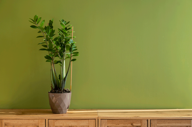
Green | Nature, balance, renewal | Living rooms, bedrooms, home offices |
Purple | Luxury, creativity, introspection | Bedrooms, artistic spaces |
White | Purity, simplicity, cleanliness | Any room |
Gray | Sophistication, modernity, calmness | Living rooms, kitchens, bathrooms |
Beige | Warmth, comfort, relaxation | Living spaces, bedrooms |
Tips on Selecting Paint Colors That Align with the Desired Mood of Each Room
Selecting paint colors that align with the desired mood of each room is essential for creating a harmonious and inviting home. Here are some tips from interior painters to help you choose the perfect colors for your spaces:
- Identify the Purpose of the Room: Determine the primary activities that will take place in the room. Consider the emotions you want to evoke when spending time in that space.
- Consult with Interior Painters: Seek advice from professional interior painters who can provide insights on the best colors to match your desired mood. Interior painters can also suggest color combinations that enhance the overall aesthetic of your home.
- Create Mood Boards: Gather samples of paint colors, fabrics, and decor items. Visualize how different colors will work together to create the desired ambiance.
- Test with Paint Samples: Apply paint samples on the walls and observe them at different times of the day. Interior painters often recommend this step to see how lighting affects the color’s appearance.
- Consider the Room’s Lighting: Natural light can enhance or diminish certain colors. Use the expertise of interior painters to choose colors that will look good in both natural and artificial light.
- Balance Bold and Neutral Colors: Use bold colors for accent walls or specific areas to create focal points. Balance them with neutral colors to avoid overwhelming the space.
Tip 3: Consider Lighting
One of the critical factors that interior painters emphasize when choosing paint colors is lighting. Both natural and artificial lighting can dramatically alter the appearance of paint colors on your walls.
Lighting | Description |
Natural Lighting | |
Morning Light | Often cooler and softer, making colors appear more muted. |
Afternoon Light | Typically warmer and more intense, brightening up colors. |
Evening Light | Can cast a yellowish or orangish hue, altering the true color of the paint. |
Artificial Lighting | |
Incandescent Bulbs | Emit a warm, yellow light that can enhance warm tones and dull cool tones. |
Fluorescent Bulbs | Provide a cooler, bluish light that can intensify cooler colors and mute warmer ones. |
LED Bulbs | Available in various color temperatures, offering flexibility to either warm up or cool down a room’s ambiance. |
How to Test Paint Colors in Different Lighting Conditions
Interior painters recommend testing paint colors in different lighting conditions to ensure you choose the right shade for your space. Here are steps from interior painters to effectively test paint colors:
- Use Paint Samples: Purchase small sample pots of the paint colors you are considering. Paint large swatches on different walls in the room to see how the color looks in various locations and lighting conditions. Here are some benefits of sample swatches:
- Accurate Color Representation: Small paint chips or digital simulations can be misleading. Swatches give a true sense of the color in your space.
- Visualizing Transitions: Helps in understanding how colors transition from one wall to another and how they interact with existing decor.
- Making Informed Decisions: Provides the confidence to make an informed decision, reducing the risk of dissatisfaction with the final result.
- Observe at Different Times: Check the painted swatches at various times of the day (morning, afternoon, and evening) to see how the colors change with natural light. Note any significant differences in color appearance as the light shifts.
- Test with Artificial Lighting: Turn on your room’s lights in the evening and observe how the paint colors look under artificial light. If possible, use different types of bulbs to see how each affects the paint color.
Tip 4: Match Undertones
When selecting paint colors, recognizing the undertones is crucial for creating a harmonious look. Undertones are the subtle hues that lie beneath the main color and can be categorized into three types:
- Warm Undertones: These include shades of yellow, orange, red, and brown. They create a cozy and inviting atmosphere.
- Cool Undertones: These encompass shades of blue, green, and purple, providing a calm and serene feel.
- Neutral Undertones: These are shades of gray, beige, and white that do not lean towards warm or cool. They offer versatility and balance.
Identifying Undertones in Existing Decor
To ensure a cohesive look, it’s essential to match the paint undertones with those present in your existing decor. Here are some steps from interior painters to identify undertones:
- Analyze Key Elements: Take note of the following essentials:
- Furniture: Look at the dominant colors in your furniture. Do they have warm, cool, or neutral undertones?
- Flooring: Examine the colors in your flooring materials, such as wood, tile, or carpet.
- Accessories: Check the hues in your curtains, rugs, and decorative items.
- Use Comparisons: Place paint swatches next to your decor items to see how the undertones align. Use a white sheet of paper to highlight the undertones in your existing colors.
Consequences of Unmatched Undertones
According to interior painters, failing to match undertones can result in a discordant and unappealing aesthetic. Here are some potential consequences of unmatched undertones in your decor:
- Visual Clutter: When warm and cool undertones clash, it can create a sense of visual clutter, making a space feel busy and uncoordinated. This can detract from the overall design and make the room less relaxing and enjoyable.
- Diminished Harmony: The lack of harmony between colors with different undertones can make the room feel disjointed. Instead of a cohesive look, the space may appear fragmented, with each element competing for attention rather than working together.
- Reduced Perceived Value: A room with mismatched undertones can look less polished and professionally designed. This can reduce the perceived value of the space, which is particularly important if you’re preparing a home for sale.
- Impact on Mood: Colors have a psychological impact, and mismatched undertones can affect the mood of the room. For example, a room intended to be calming might feel unsettling if cool and warm undertones are mixed inappropriately.
- Highlighting Flaws: Unmatched undertones can inadvertently highlight flaws in your decor. Clashing colors can draw attention to imperfections or areas that are not well-coordinated, making them more noticeable.
Tip 5: Create Visual Flow
Creating visual flow in home design ensures that each room transitions seamlessly into the next. Achieving this requires strategic use of paint colors to connect spaces while allowing each room to maintain its unique character. Interior painters emphasize the importance of visual flow for a polished and well-designed home.
Visual Flow and Continuity
Visual flow is vital in open-plan spaces where the boundaries between rooms are less defined. Continuity can be achieved through consistent color schemes, patterns, and design elements that guide the eye naturally from one space to another.
Strategies for Using Paint Colors to Create a Seamless Transition
Creating a seamless transition between rooms with paint colors is key to achieving a cohesive and harmonious home design. Here are some effective strategies to help you use paint colors to create visual flow throughout your space:
Unified Color Palette
- Choose a Base Color: Select a neutral or base color that can be used in various shades throughout the home. Interior painters often recommend colors like soft grays, beiges, or whites.
- Incorporate Accent Colors: Use one or two accent colors that can be repeated in different rooms to tie the spaces together.
Gradual Color Transitions
- Ombre Effect: Gradually transition from one color to another using an ombre technique. This can be subtle yet effective in creating flow.
- Adjacent Colors: Select colors that are next to each other on the color wheel for adjacent rooms. For example, a living room in soft blue can transition into a dining room in a gentle green.
Consistent Trim and Molding Colors
- Uniform Trim: Use the same color for trim, moldings, and doors throughout the home. Interior painters suggest that this consistency helps anchor the design and provides a visual link between spaces.
- Contrasting Trim: Alternatively, use a contrasting trim color to create definition while maintaining flow.
Frequently Asked Questions
What is the best type of paint for interior walls?
The best type of paint for interior walls depends on the room and its use. For most rooms, top interior painters recommend using latex or water-based paint. This is a popular choice due to its durability, ease of cleaning, and quick drying time. For high-moisture areas like bathrooms and kitchens, mildew-resistant paint is recommended. Semi-gloss and gloss finishes are ideal for trim and doors due to their durability and ease of cleaning. Flat or matte finishes work well for ceilings and low-traffic areas as they hide imperfections but are harder to clean.
Do I need to prime the walls before painting?
Priming the walls before painting is essential for several reasons. Primer helps to create a uniform surface, ensuring better adhesion of the paint and a more even finish. It’s especially important when painting over dark colors, new drywall, or stained walls. Primer can also help cover imperfections and block stains from bleeding through the paint. Skipping the primer can result in uneven color and reduced durability of the paint job.
How many coats of paint do I need?
Typically, two coats of paint are recommended for a professional-looking finish. The first coat provides a base layer, while the second coat ensures even coverage and depth of color. However, the number of coats needed can vary depending on the quality of the paint, the color change, and the type of surface being painted. High-quality paints often provide better coverage with fewer coats.
How can I prevent streaks and roller marks when painting?
To prevent streaks and roller marks, use high-quality brushes and rollers and apply the paint evenly. Load the roller with paint and roll it over the tray’s grid to remove excess paint. Apply the paint in a “W” or “M” pattern and fill in the gaps with horizontal strokes. Maintain a wet edge by working in small sections and overlapping slightly with each stroke. Avoid pressing too hard on the roller, and use long, even strokes for a smooth finish.
What are the common mistakes to avoid when painting interiors?
Common mistakes to avoid when painting interiors include insufficient surface preparation, not using primer, and using low-quality tools. Skipping surface cleaning and repairs can result in paint not adhering properly or highlighting imperfections. Not using painter’s tape for clean edges and protection can lead to messy results. Applying too much paint on the brush or roller can cause drips and uneven texture. Rushing the process without allowing proper drying time between coats can compromise the finish.
Enhance Your Home’s Harmony with Expert Interior Painting!
Achieving a cohesive and visually appealing home can be challenging, but West Hartford House Painting Experts are here to help. Our experienced interior painters in West Hartford, CT, specialize in creating seamless transitions and visual flow throughout your home. Let our skilled team in West Hartford, CT, guide you through the process, ensuring a beautiful and harmonious result that enhances the charm and comfort of your home.
Contact West Hartford House Painting Experts today to get started on your next painting project in West Hartford, CT!