 7 Soothing Color Combinations for a Calm, Modern Nursery
1. Yellow and Green
A cheerful and soft mix like yellow and green can bring life to a modern nursery without overwhelming the senses. This combination is bright enough to make the space feel happy but still gentle enough to promote calmness.
Key Shades That Make Yellow and Green Work
Yellow and green work especially well in nurseries when the right tones are chosen. Soft, muted variations of these colors can create a balanced look that feels both fresh and restful. These shades help establish soothing interior color palettes that support a peaceful, baby-friendly atmosphere.
- Soft Lemon Yellow: Adds warmth and light to the room, making it feel sunny and welcoming.
- Muted Sage Green: Promotes a sense of calm and nature-inspired tranquility.
- Pastel Chartreuse Accents: Adds just enough pop for a fun and energetic vibe, especially in bedding or wall art.
- Natural Materials: Pairing these colors with wicker, light wood, or linen textures keeps the look grounded and peaceful.
Tips for Working With Yellow & Green
These soothing interior color palettes offer a lot of flexibility. With the right elements, it can feel both cozy and refreshing.
- Stick to Soft Tones: Choose muted versions of yellow and green to keep the space from feeling too bright or loud.
- Use One Color as a Base: For example, paint the walls a soft green and bring in yellow through decor or textiles.
- Add Warm Neutrals: Use off-whites or light beiges to tie everything together and avoid color overload.
- Choose Nature-Inspired Decor: Think leaves, sun motifs, or floral prints to highlight the natural feel of the palette.
- Balance With Texture: Woven baskets, cotton blankets, and light wood furniture help keep the look soft and welcoming.
2. White and Grey
White and grey are classic, calming tones that offer a modern and uncluttered feel. This pairing is great for creating a nursery that feels bright and orderly without appearing too stark. Its simplicity allows other details—like decor, furniture, and personal touches—to shine through.
Shades and Textures That Elevate a White and Grey Nursery
A white and grey palette gains depth and personality when layered with the right tones and materials. Soft greys paired with cozy whites help the room feel relaxed yet textured, supporting restful routines and visual comfort.
- Cool-Toned Grey Walls: Offers a soft, enveloping feel that’s gentle on the eyes and comforting for babies.
- Soft White Curtains or Rugs: Brightens the space by reflecting natural light, making the room feel airy and open.
- Warm Grey Furniture: Brings in contrast and subtle character without overpowering the room.
- Layered Textures: Materials like cotton, wool, or knits add visual interest and a cozy feel to balance the minimal color scheme.
Tips for Styling With White and Grey
A thoughtful approach to white and grey keeps the room peaceful but never boring. It’s also a great base for adding muted tones for relaxation.
- Mix Different Shades of Grey: Use light and mid-tones to create contrast while keeping a soft, blended feel.
- Add Subtle Patterns: Use soft stripes or polka dots in bedding or wallpaper to bring gentle interest without disrupting the calm.
- Introduce Natural Elements: Items like wooden toys or rattan baskets help break up the monochrome with an earthy texture.
- Keep the Base Light: Use white as the dominant color for a brighter, more open feel, especially in smaller nurseries.
- Use Fabric Layers: Layer soft blankets, knit pillows, and cotton bedding to make the space feel warm and inviting.
3. Soft Neutrals
Soft neutrals are a go-to choice when it comes to calming room colors for nurseries, bedrooms, or any space meant to feel calming. These shades include gentle tones like beige, taupe, and ivory. They create a serene backdrop that’s easy to build on with textures and layers.
Shades of Soft Neutrals
These peaceful bedroom paint colors help create an environment that feels restful and safe, especially for babies and young children.
- Beige: A warm, sand-like color that brings comfort and coziness to any room. It works well with white furniture and light wood accents.
- Taupe: A mix of grey and brown that adds a little more depth to the space. Taupe can ground the room while still feeling gentle.
- Ivory: A soft, off-white shade that feels clean and airy. It brightens up the space without being stark or cold.
How to Use Soft Neutrals in a Nursery
Soft neutrals are peaceful bedroom paint colors that offer flexibility and timeless style, especially when used as a base color.
- Walls in Neutral Tones: Use ivory or warm beige as wall colors to set a peaceful mood. These make excellent tranquil wall colors.
- Natural Wood Accents: Add wooden cribs, shelves, or toys in oak or maple tones to bring in a natural and calming vibe.
- Layered Textures: Use soft rugs, muslin curtains, and woven baskets to keep the space from feeling flat.
4. Navy and White
Navy and white is a timeless color combo that balances depth and clarity. It feels calm, bold, and clean all at once. Navy brings richness and weight, while white keeps the space open and light. Together, they offer a smart contrast that still fits within peaceful bedroom paint colors.
Theme Ideas Using Navy and White
Navy and white offer a strong visual base that works across a variety of nursery styles. This palette isn’t just calming—it also brings character, making it easy to personalize the space with subtle themes or accent details.
- Nautical Influence: Add touches like anchors, sailboats, or rope details for a soft coastal feel.
- Starry Night Theme: Combine navy walls with white stars, moon decals, or constellation prints for a dreamy nighttime atmosphere.
- Modern Minimalist: Keep the look sleek with clean lines, white furniture, and a few bold navy elements for contrast.
- Classic Storybook: Use navy and white as a backdrop for colorful book displays, plush toys, or framed illustrations that pop.
Tips for Using Navy and White Shades
Despite its contrast, this combo fits right in with muted tones for relaxation when used thoughtfully.
- Accent Walls in Navy: A single navy wall behind the crib can create a strong focal point while keeping the rest of the room light and airy.
- White Furniture: Cribs, dressers, or shelves in white help balance the room and avoid a too-dark feeling.
- Soft Textiles: Use bedding, curtains, or rugs with gentle patterns to introduce visual interest in a calming way. Incorporating soft textures can support a child’s development by encouraging creativity, emotional balance, and cognitive growth.
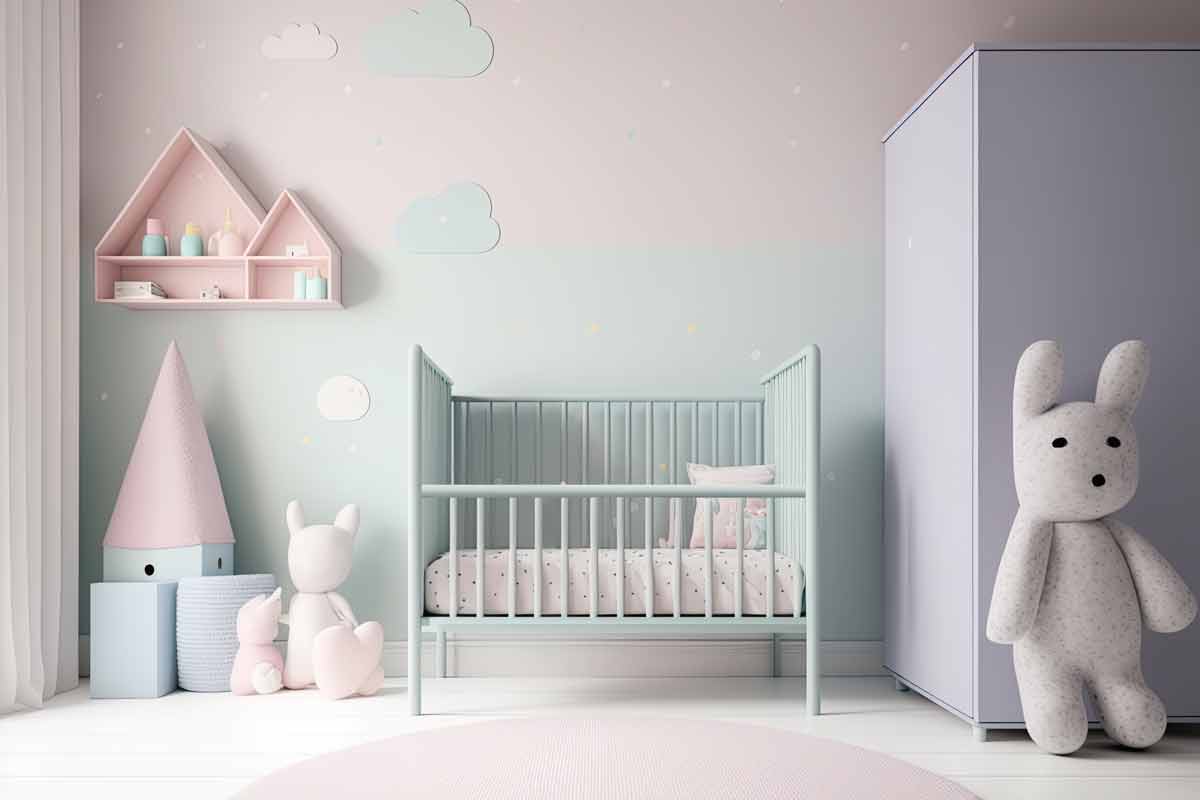
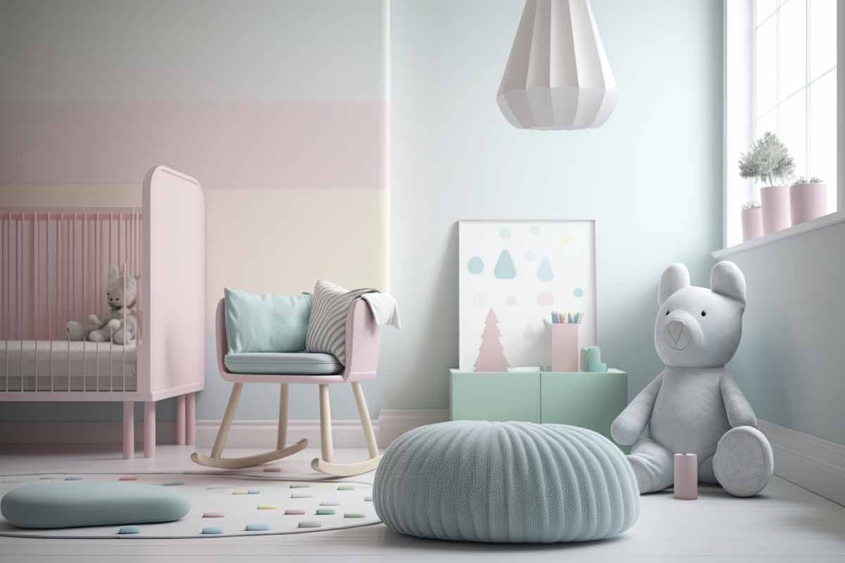
5. Soft Pink and Grey
A soft pink and grey palette is one of the most calming room colors for a nursery. It’s gentle, modern, and effortlessly stylish. This soothing blend creates a nurturing space that helps babies (and parents) feel relaxed and at peace.
Furniture and Finishes That Complement Soft Pink and Grey
The success of a soft pink and grey nursery often comes down to the furniture choices and finishing details. These elements help shape the room’s overall mood and ensure it feels cohesive and inviting.
- White or Cream Furniture: Cribs, dressers, and bookshelves in soft neutrals add brightness and contrast without clashing with the main palette.
- Brushed Metal Accents: Use gold, silver, or rose gold for curtain rods, drawer handles, or light fixtures to introduce subtle elegance.
- Upholstered Rocking Chairs: Choose pale grey or blush fabric for cozy, functional seating that blends seamlessly into the space.
- Natural Wood Details: Light oak or birch tones add warmth and a bit of organic charm to balance the soft hues.
- Low-Gloss Paint Finishes: Matte or satin finishes on walls and furniture enhance the calm, muted atmosphere without any harsh shine.
How to Style a Soft Pink and Grey Nursery
When using soft pink and grey, the key is balance—combining cozy elements with simple finishes for a space that feels gentle but polished. These peaceful bedroom paint colors are ideal for building a serene setting with a personal touch.
- Accent Walls or Wallpaper: Use floral, geometric, or cloud-inspired patterns in soft pink and grey to add visual interest without overwhelming the room.
- Textile Layers: Add plush rugs, cotton bedding, and knit throws in matching tones to create warmth and comfort through texture.
- Mixed Finishes: Combine matte grey furniture with soft pink accessories, or vice versa, to keep the space feeling layered and styled.
- Subtle Wall Art: Choose framed prints in white, beige, or soft metallics to complement the palette and add gentle contrast.
- Functional Storage: Use woven bins or painted shelves in blush or dove grey to keep the nursery tidy while matching the color scheme.
6. Grey and Natural Wood
Grey and natural wood is a modern nursery favorite. These soothing interior color palettes mix cool and warm elements to give the room a grounded, cozy feel. The cool tones of grey bring in calm and subtlety, while the warmth of natural wood adds texture and comfort. It’s ideal for parents who want a balanced, earthy space without relying on bold colors
Design Details That Elevate Grey and Natural Wood
Thoughtful elements bring this palette to life and make the space both functional and calming.
- Grey-Toned Wall Paints: Choose soft greys with warm or neutral undertones to avoid a cold look. These tranquil wall colors create a smooth, peaceful backdrop that works in any lighting.
- Natural Wood Finishes: Stick to light to medium woods like birch, oak, or maple for a softer, nursery-friendly tone. They provide a warm contrast to grey while fitting seamlessly into soothing interior color palettes.
- Simple Decorative Accents: Add minimal wall art, soft mobiles, or wooden name signs to complement the natural theme. Keeping the decor simple supports muted tones for relaxation and prevents visual clutter.
- Cozy Floor Layers: Use light-colored rugs with soft textures to add warmth and comfort underfoot. These subtle additions help complete the look using peaceful bedroom paint colors as the base.
Color Pairing Ideas to Expand the Look
Combining grey and natural wood with the right accents can add depth and character without losing the calming effect.
- Pale Sage or Olive Accents: These greens add a soft, earthy touch that complements the natural wood. Their presence blends beautifully with tranquil wall colors and enhances the organic vibe.
- Warm White or Cream Details: Use these for trims, textiles, or lighting to keep the room feeling bright and balanced. These shades work well with peaceful bedroom paint colors and soften the overall contrast.
- Dusty Blue or Slate Accessories: Add subtle cool tones with blankets, cushions, or storage bins. These colors extend the look while remaining within soothing interior color palettes that promote rest.
- Soft Taupe or Greige Highlights: Perfect for curtains or area rugs, these in-between tones add harmony. They pair effortlessly with both grey and wood, supporting muted tones for relaxation without drawing too much attention.
7. Sky Blue and White
Sky blue and white is a timeless pair that instantly brings a sense of freshness and light into a nursery. As one of the most popular calming room colors, this combination mimics clear skies and puffy clouds, helping to create a peaceful atmosphere that encourages rest.
Design Ideas for a Sky Blue and White Nursery
Sky blue and white offer a clean, airy look that’s easy to work with across a range of nursery styles. The key is using the palette creatively through furniture, finishes, and small decor touches.
- Painted Ceilings or Murals: Use sky blue on the ceiling or in soft cloud-shaped murals to create a dreamy, open-sky effect.
- White Cribs and Rockers: Keep the furniture light and simple to emphasize brightness and maintain a fresh, breathable feel.
- Cloud-Inspired Decor: Add soft shapes like cloud pillows, star mobiles, or sky-themed wall art to reinforce the calming palette.
- Blue-and-White Striped Textiles: Choose bedding, curtains, or rugs with subtle stripes to introduce a gentle pattern without overwhelming the room.
- Natural Elements: Mix in wicker baskets, light wood shelving, or linen fabrics to add warmth and balance to the cool tones.
Nursery Themes and Accents Using Sky Blue and White
Sky blue and white offer a flexible base for creating playful or serene nursery themes. With the right accents and styling, this palette can shift from dreamy and whimsical to clean and modern.
- Sky and Weather Theme: Incorporate sun, cloud, and rainbow wall decals or mobiles to bring a gentle sky-inspired story to life.
- Minimal Modern Look: Stick with solid sky blue walls, white furnishings, and soft, simple lines for a calm and clutter-free atmosphere.
- Storybook Corners: Use floating white shelves with pastel books, blue-toned stuffed animals, and soft lighting to create a cozy reading nook.