✔ Gray is a versatile foundation that pairs well with both warm and cool tones in modern kitchens.
✔ Navy blue, sage green, blush pink, mustard yellow, and warm white are top colors that go with grey.
✔ Layering textures like wood, metal, and stone enhances gray-based palettes and adds depth.
✔ Seasonal accents offer a flexible way to refresh gray kitchens without permanent changes.
✔ Testing paint and finishes in real lighting prevents clashing and ensures a cohesive look.
✔ Working with professionals helps homeowners choose coordinating colors with gray tones confidently.
✔ A well-planned color palette idea with gray can make any kitchen feel modern, warm, and visually balanced.
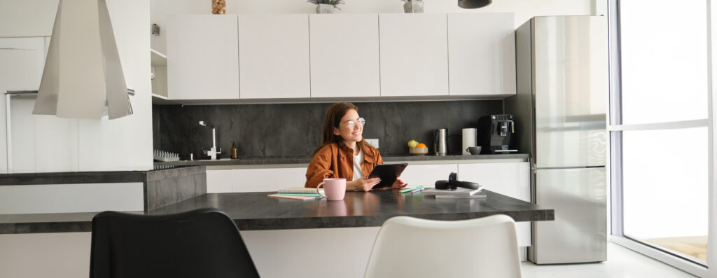
Gray sets the tone in many of today’s modern kitchens—elegant, understated, and endlessly adaptable. It complements natural wood, marble, matte black fixtures, and brushed gold hardware. However, its true potential shines when paired with colors that add warmth, contrast, or an unexpected touch of charm.
With the average ROI for interior painting around 107%, a well-designed gray palette can add $2,140 to $16,050 or more in resale value. This proves that style and smart investment can go hand in hand.
Here are five ways to make the most of colors that go with grey.
Navy blue brings a timeless richness to gray kitchens, offering a strong contrast that still feels balanced. Its deep, saturated tone enhances both cool and warm gray shades, making it one of the most versatile pairings. Used thoughtfully, navy adds depth and polish without overpowering the clean, modern lines of a contemporary space.
Sage green is soft, calming, and naturally pairs well with both warm and cool grays. If you’re wondering what color goes with gray, sage is a versatile option that adds warmth and a hint of color without clashing, making it a subtle standout in modern kitchens. This nature-inspired hue introduces a grounded, organic vibe that complements the sleek edges often found in gray kitchen designs.
Blush pink brings a gentle, unexpected warmth that softens the cool edge of gray. It’s a delicate yet sophisticated color that works surprisingly well in modern kitchens, especially when layered with light gray and metallic accents. Used in moderation, it adds charm and personality without tipping into overly feminine territory.
Mustard yellow is bold, warm, and full of personality—a sharp contrast to gray’s cool neutrality. When used thoughtfully, it injects energy and a retro-modern flair without overwhelming the space. This shade works particularly well in mid-century-inspired kitchens or designs that embrace vintage details with modern updates.
Warm white is a natural partner to gray—crisp enough to brighten the space, but soft enough to keep it inviting. Unlike cool white, warm white has subtle yellow or beige undertones that blend seamlessly with gray tones, especially those with taupe or greige elements. It’s a clean, timeless combo that works in nearly every kitchen style.
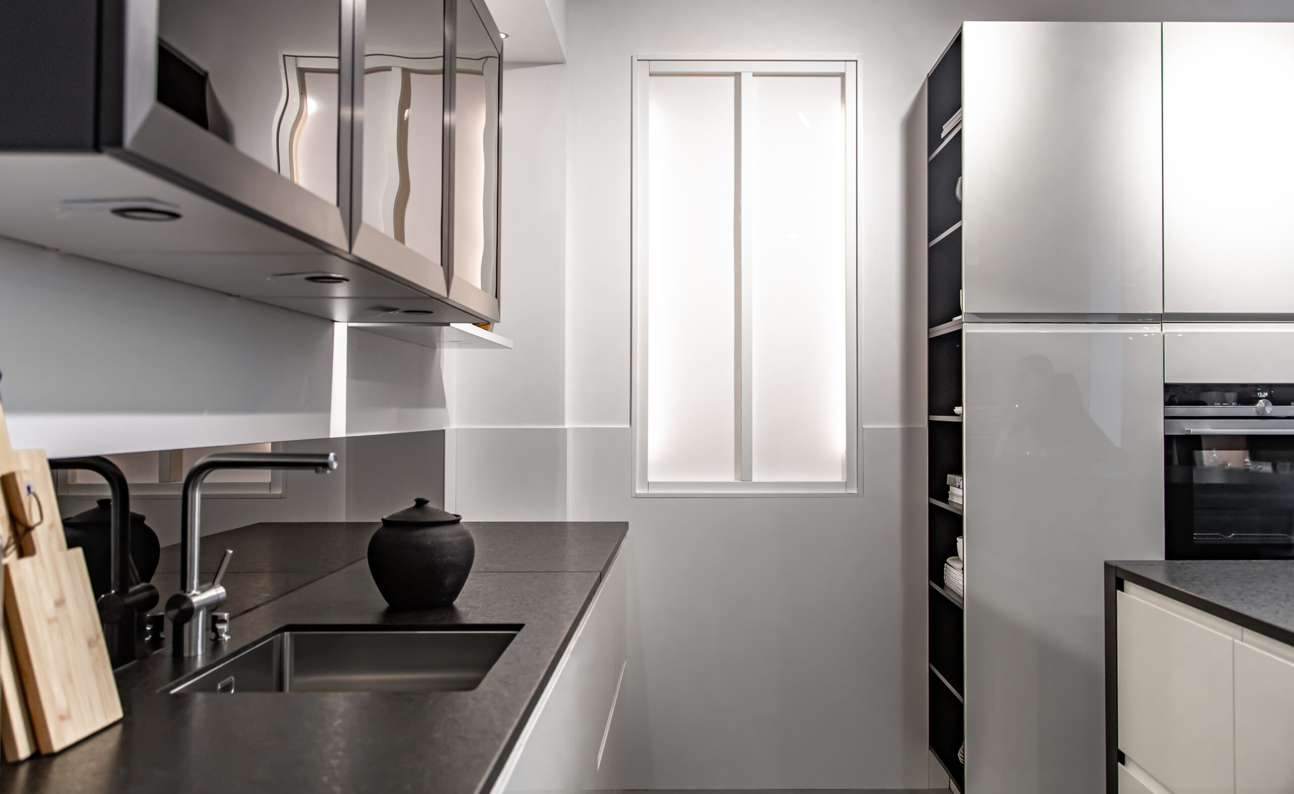
Gray on its own can feel flat without the right textures and materials—but when paired thoughtfully, it becomes the foundation for a layered, inviting kitchen design. Mixing surfaces that reflect light differently and incorporating tactile finishes enhances visual contrast and unlocks the full potential of colors that go with gray.
As homeowners explore rich, livable color palette ideas and consider what color goes with gray, it’s no surprise the interior paint market is projected to reach USD 115.42 billion by 2033. Here are ways to use textures and materials to elevate a space:
Combining smooth, matte gray cabinetry with open wood shelving or a butcher block counter adds both warmth and character. The grain and texture of natural wood bring out the softer side of gray and help balance cool tones. This pairing also introduces subtle coordinating colors with gray tones that ground the space and give it an organic, layered feel.
Brushed nickel, stainless steel, or aged brass fixtures can bring gray tile backsplashes or walls to life. These metal finishes reflect just enough light to create movement without clashing with the surrounding palette. Working with a interior designer ensures these small details enhance the overall scheme of matching colors with grey instead of blending into the background.
High-gloss quartz or marble countertops offer a sleek counterpoint to more tactile surfaces like handmade ceramic or zellige tile. This contrast between smooth and uneven surfaces draws the eye and adds depth to kitchens dominated by gray. It’s an easy way to create drama while keeping within a refined color palette idea with gray.
For homeowners aiming for an industrial-modern feel, concrete countertops or walls in soft gray tones provide the perfect canvas. Their raw finish plays well with smoother materials like glass, wood, or polished metal. A professional’s eye can help balance the harsher edges with colors that go with grey to keep the space from feeling too cold.
Woven bar stool cushions, roman shades, or upholstered breakfast nooks in shades like sage, blush, or oatmeal help soften a predominantly gray kitchen. These fabrics add tactile warmth and bring in subtle, supportive coordinating colors with gray tones. Designers can help select materials that are durable and visually aligned with the kitchen’s overall tone.
Glass cabinet doors, glossy tiles, or metallic light fixtures can make gray tones feel brighter and more open. These reflective materials bounce light around the room, enhancing both soft and deep grays without adding more color. It’s a smart way to support matching colors with grey while keeping the palette airy and modern.
A gray kitchen offers the perfect backdrop for color updates throughout the year. Its neutral base makes it easy to introduce seasonal accents without committing to a full renovation. With a few intentional swaps—often guided by a professional designer—homeowners can explore fresh color palette ideas with gray and discover new colors that go with grey each season.
Spring is the ideal time to introduce soft pinks, mint greens, or pale yellows through dishware, linens, or small decorative accents. These gentle hues pair beautifully with light gray cabinets or walls and bring in a sense of renewal. A designer can help choose pastel coordinating colors with gray tones that don’t feel too youthful or out of place in a modern kitchen.
For a bold summer refresh, try lemon yellow, coral, or turquoise against charcoal or medium-gray tones. Swap in vibrant bar stools, art prints, or patterned runners to create a lively, sun-filled atmosphere. These high-energy colors that go with grey can make the kitchen feel more dynamic during the warmer months.
Rust, burnt orange, and olive green are perfect for creating a cozy fall kitchen that still feels contemporary. Introduce these hues through ceramic bowls, kitchen towels, or even seasonal produce displayed in open shelving. With professional guidance, these earthy matching colors with grey can create a look that feels intentional rather than temporary.
Rich tones like emerald, navy, and plum can add warmth and elegance to a cool gray palette during the winter. Try using velvet seat cushions, moody floral arrangements, or metallic accessories to create contrast. A designer can help balance these deep shades with the right lighting and layout for seasonal impact.
Art prints, framed textiles, or even floating shelves styled with season-specific décor offer an easy way to refresh the space. Choose frames in coordinating materials—like black metal, wood, or brushed gold—to keep them cohesive with gray surroundings. These rotating displays allow homeowners to subtly explore color palette ideas with gray without permanent changes.
Exchanging mugs, plates, or even cookware with seasonally colored versions can bring subtle, satisfying shifts to a gray kitchen. For example, white and pale blue in winter, mustard and terracotta in fall, or sea glass tones in summer. A professional stylist can help curate a cohesive shelf display that plays well with coordinating colors with gray tones and doesn’t clutter the space.
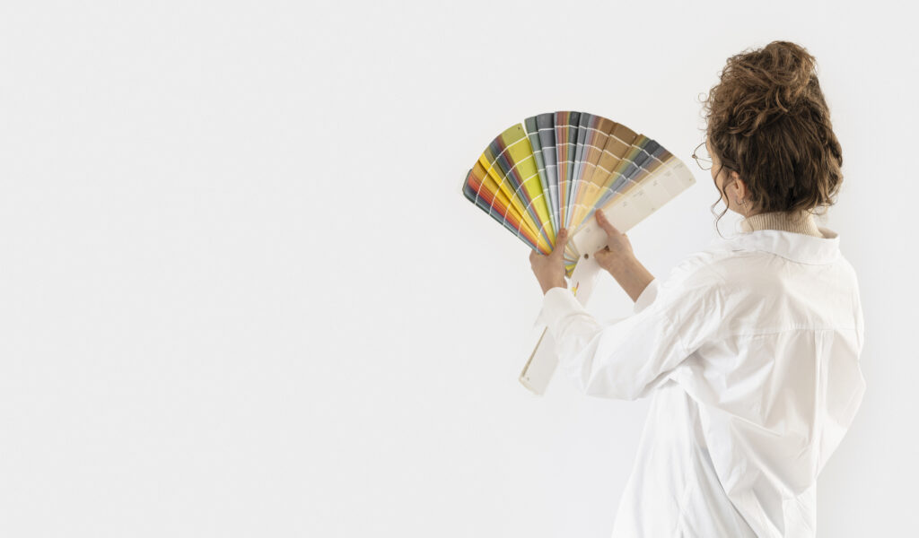
Gray is a complex color that changes depending on lighting, surrounding materials, and finishes. Before locking in a final design, it’s important to test how paint, cabinetry, and finishes interact together. Working with a design professional can make the testing process more efficient and help homeowners select colors that go with grey with clarity and confidence.
Gray tones can shift dramatically between natural daylight, warm bulbs, and evening shadows. Test paint swatches on multiple walls and observe them over a few days to see how the color holds up throughout the day. A designer can help spot undertones early and guide clients toward coordinating colors with gray tones that remain stable in their specific lighting.
Even the perfect gray paint can look off if it clashes with countertops or floors. Always test samples directly next to quartz, marble, tile, or wood to see how the tones interact. Designers often bring physical samples to show how matching colors with grey work with permanent fixtures.
Create sample boards with swatches of cabinetry paint, backsplash tile, hardware, and countertop materials. Seeing everything together helps prevent surprises during installation and gives a full picture of the final palette. This layered approach helps homeowners experiment with different color palette ideas with gray before committing.
Finish plays a big role in how gray paint reads—gloss reflects more light and can feel cooler, while matte tends to soften the tone. Test different finishes in the same color to see which works best in the space. If you’re still deciding what color goes with gray, a professional can advise not only on color choices but also on where each finish makes the most sense based on wear and design intent.
Instead of small paint chips, apply at least a 2’x2′ swatch of each sample directly onto the wall or cabinetry surface. Move them around to see how they look against both light and dark areas of the kitchen. This hands-on testing helps reveal how well the chosen colors that go with grey integrate with the rest of the room.
Color consultants are trained to spot subtle undertones and predict how different elements will age over time. Their input can prevent costly mistakes and ensure that all finishes—paint, tile, stone, and hardware—work in harmony. With their expertise, homeowners can confidently move forward with coordinating colors with gray tones that elevate the space.
Lighter wood tones like white oak, ash, or natural maple offer a warm, modern contrast to gray cabinets. These wood finishes soften the coolness of gray and complement both light and dark palettes. When thoughtfully selected, they become one of the most versatile colors that go with grey in transitional and contemporary kitchens.
Gray works beautifully in traditional kitchens when paired with classic details like crown molding, paneled cabinetry, and antique-inspired hardware. Richer shades of gray, like slate or pewter, give a timeless look that blends seamlessly with heritage designs. A professional can help select matching colors with grey that feel classic instead of trendy.
Yes, as long as the tones are balanced and thoughtfully placed. For example, pairing warm wood floors with cool gray cabinets works well when a transitional color—like greige or taupe—is used as a bridge. Professionals often use this approach to create well-blended color palette ideas with gray that feel layered and intentional.
Both options can work, depending on the desired mood and layout. A soft contrast like warm white or sage green keeps the space airy, while a deeper tone like navy adds drama and depth. Either way, it’s important to choose coordinating colors with gray tones that support the room’s lighting and flow.
Overly saturated neon tones—like lime green or bright magenta—can feel out of place next to most gray tones. These colors often fight the natural softness of gray and break up the harmony of the space. Designers typically steer clients toward colors that go with grey that offer subtle contrast rather than jarring interruption.
A fresh coat of paint can completely change the feel of a gray kitchen—especially when handled by seasoned pros. Westport Professional House Painters offers expert interior painting services tailored to highlight colors that go with grey and enhance modern kitchen designs. From cabinets to walls, our team in Westport, CT, knows how to balance texture, tone, and finish for results that feel both fresh and timeless.
Work with us today!